
In the previous post we started talking about misleading statistics and how they can be used to deceive people. Since we have a lot to say about it, we decided to make it a series of posts, so we can focus on different issues. Today we will talk about the importance of the data sources when dealing with statistics. When you are presented with any big claims (or not so big) it is always good to know:
- When the data was collected – you may be surprised how many claims are made using outdated information
- Who the data comes from – are the people who released the data completely unbiased?
- Is the information geographically relevant – data from one region of the country is not representative of the whole country. Not mentioning data collected in different countries.
When
Check if the data is relevant and still applicable in the current context. One very well-known example is “one out of three women over the age of 35 will not have conceived after a year of trying”. Turned out that statistics was based on the data from 1700s France! Obviously, a lot has changed since then in terms of living conditions and healthcare development, but the outdated misleading statistics have still been used to frighten women in their late 30s. Some new studies have been conducted in the last few decades that showed different results. So, always check if the data presented to you is up to date.
Who
Another aspect of the data source is who actually makes those claims. Corporations and / or politicians may use several different techniques to show the data in a way that benefits them.
Ever saw this graph from Fox News?

Visually it looks like there is still a long way to reach the goal. But here is what it will look like if you change the Y axis:
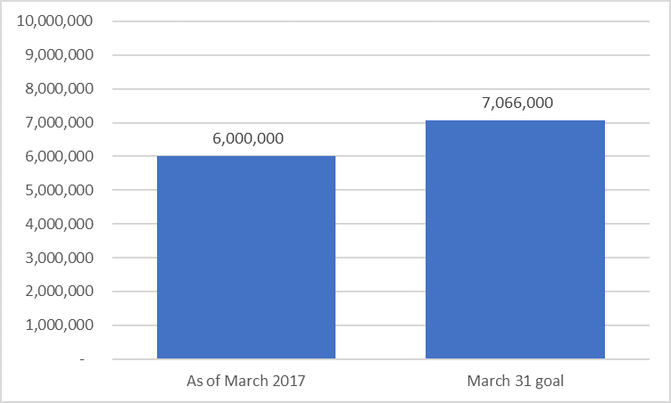
So, it looks like whoever made that first graph for Fox News wanted to understate the results compared to the goal. We will talk more about data visualisation techniques used in a deceptive way in one of our later posts.
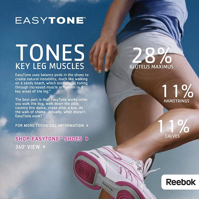
If a certain product manufacturer makes serious claims about their product (e.g. chocolate helps you lose weight) then you probably should look for alternative sources of information on this topic. While sometimes the misleading statistics is a result of some manipulations, other times it can be just a lie. One famous example is Reebok’s advertising campaign from 2009 and 2010. They claimed that “Lab tests “proved” that the shoes work “your hamstrings and calves up to 11% harder and tone your butt up to 28% more than regular sneakers … just by walking!” which was just a blatant lie for which Reebok had to pay $25 million as part of the settlement agreement.
So, next time you hear a big claim about something, check where (or who) that data came from, when and where the study was conducted and how relevant it is in the current context.
If you want Aspect to help with your data or any research project, please CLICK HERE
Sources and further reading:
https://academic.oup.com/humrep/article/19/7/1548/2356634#37472300
https://www.bbc.co.uk/news/magazine-24128176


Leave A Comment