Continuing our series of How Not to Get Fooled by Statistics our post today is about recognising misleading graphs or charts. Data visualisation is good, it helps us easily understand otherwise complex data and focus on what’s important. However, it is also a powerful tool for data manipulation and deception. There are so many misleading graphs and charts out there, it’s terrifying!
Scales distortion
One of the ways to use charts to manipulate data is to distort scales. Have a look at this Chevy ad from 1992:
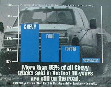
Image source: https://ed.ted.com/lessons/how-to-spot-a-misleading-graph-lea-gaslowitz
“More than 98% of all Chevy trucks sold in the last 10 years are still on the road”. Looks impressive, right? Now, let us have a closer look at it. When we see this kind of graph, we automatically think that sizes of the bars are proportionate to their values. So, visually Chevy’s bar looks almost twice as big as Toyota’s. But if you look carefully you will notice that the Y axis starts from 95%, so the percentage for Toyota is actually a bit higher than 96%.
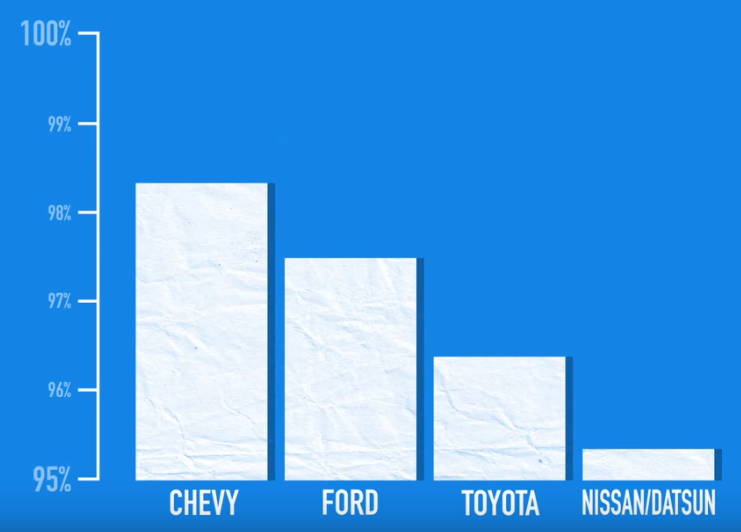
Image source: https://ed.ted.com/lessons/how-to-spot-a-misleading-graph-lea-gaslowitz
If we were to reset the Y axis to start from 0, then the graph would look more like this:
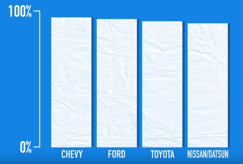
Image source: https://ed.ted.com/lessons/how-to-spot-a-misleading-graph-lea-gaslowitz
Now the visual difference is not that big which makes the claim much less impactful.
3D pie charts
I personally think using any 3D charts should be made illegal to begin with. I don’t know why anybody would want to use them… Oh wait a minute, I do know! They want to use them to exaggerate certain data points and make others look much less visible.
Look at this chart from the Hyundai Verna ad below. The slice for Verna is at the foreground and of a bright yellow colour while all other brands are on the background and have a dark colour. This way all your attention is focussed on the big Verna slice.
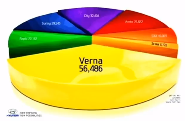
Image source: https://chandoo.org/wp/why-3d-pie-charts-are-evil/
Now, let us see what happens if we make this chart flat:
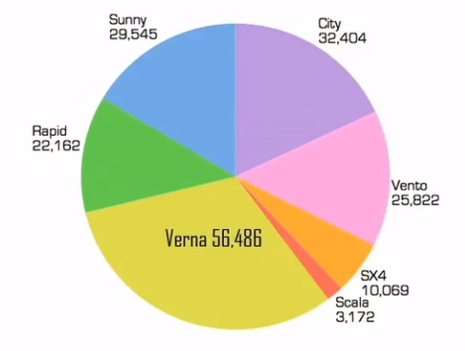
This way Verna still has the biggest share of the pie, but you can also clearly see all other brands and their values. Now Verna doesn’t look as dominant as in the previous version of the chart.
Using the wrong types of charts for the purpose
There is a wide variety of different types of charts which is great, but each of them is good for its purpose. Imagine your data looks like this:
| Brand awareness | |
| Brand A | 70% |
| Brand B | 60% |
| Brand C | 65% |
Now, let us build a pie chart using the data from this table:
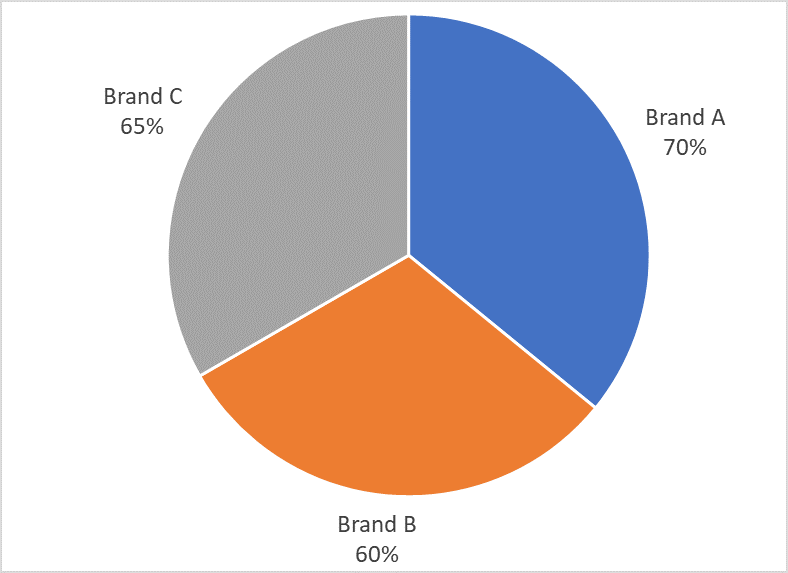
The first problem with this chart is that the total does not add up to 100% because each respondent could name more than one brand. You can ONLY use pie charts when the total adds up to 100% to show the share of each data point. It may seem obvious, but it is surprising how often people use pie charts with the wrong data. Now visually the segments on this chart look very similar which can make viewers think there is no difference between the brands.
Let us see what a bar chart will look like with the same data:
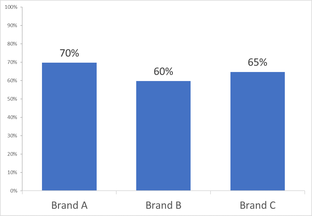
This way you can clearly see the difference between the brands and there is no confusion as to who the leader is.
Graphs using cumulative data
Using cumulative data is always misleading, graph or no graph. There has to be a very specific purpose to it, otherwise it does not make much sense to present cumulative data at all. One of the famous examples of misleading graphs is this one from Apple’s Tim Cook’s presentation in 2013:
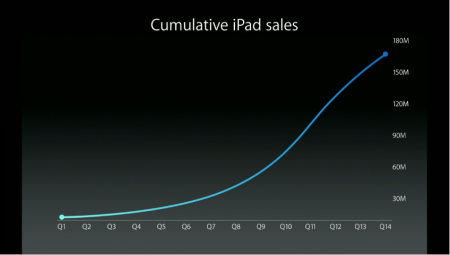
Image source: https://qz.com/138458/apple-is-either-terrible-at-designing-charts-or-thinks-you-wont-notice-the-difference/
Looks nice, right? Seems like Apple are doing incredibly well with the sales growing from quarter to quarter. But the thing is, cumulative numbers will always show an upwards trend. The very next day after that presentation David Yanofsky of QZ.com built an alternative graph using the real iPad sales from Apple’s reports:
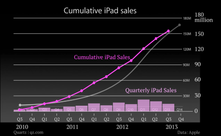
Image source: https://qz.com/138458/apple-is-either-terrible-at-designing-charts-or-thinks-you-wont-notice-the-difference/
Not only was the line in Tim Cook’s presentation unnecessarily curved but also, in reality iPad sales had been declining over the last few quarters.
There are plenty more examples of misleading graphs we could show here but the bottom line is – data visualisation is a very useful tool when used correctly. Whenever you see a beautiful chart/graph, pay close attention to the data itself and see if anything looks suspicious.
If you want Aspect to help with your data or any research project, please CLICK HERE
Sources and more information:
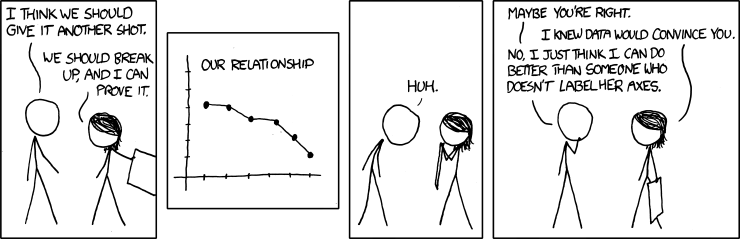
Featured image source: https://xkcd.com/833/
How to Lie with Statistics video – https://youtu.be/gABkW0IbG30


Excellent post. I certainly love this website. Keep writing!
Excellent post however , I was wondering if you could write
a litte more on this subject? I’d be very grateful if you could elaborate a little bit further.
Thank you!
Excellent blog you’ve got here.. It’s difficult
to find good quality writing like yours these days. I truly appreciate people
like you! Take care!!
Awesome things here. I’m very glad to see your article. Thanks a
lot and I’m taking a look ahead to touch you.
Will you kindly drop me a mail?
Awesome blog article. Really looking forward to read more. Keep writing. Ellynn Wolfgang Hapte Donia Skelly Kit
Attractive element of content. I just stumbled upon your web site and
in accession capital to say that I get actually loved account your blog posts.
Any way I’ll be subscribing to your feeds and even I fulfillment you
get admission to consistently fast.
Article writing is also a excitement, if you be acquainted with
afterward you can write otherwise it is complex to write.