Misleading graphs in statistics – how not to get fooled by them
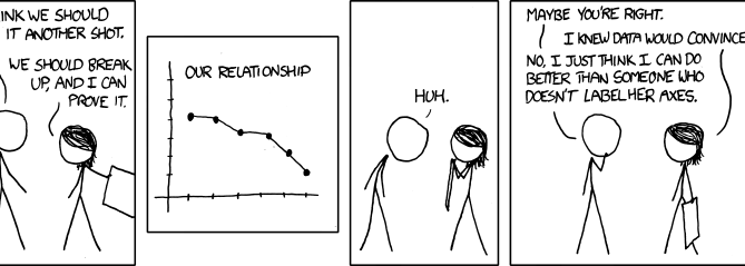
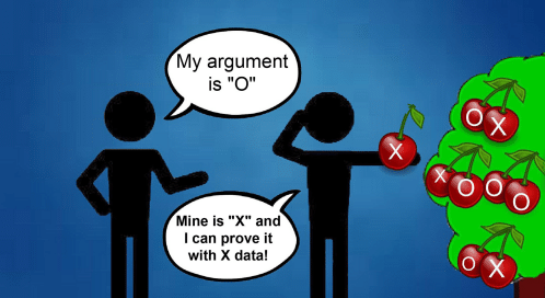
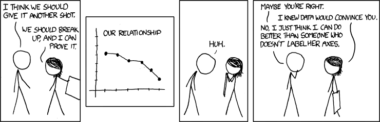
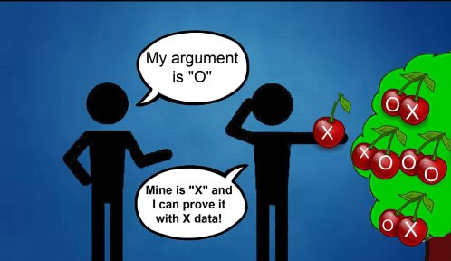
Continuing our series of How Not to Get Fooled by Statistics our post today is about recognising misleading graphs or charts. Data visualisation is good, it helps us easily understand otherwise complex data and focus on what’s important. However, it is also a powerful tool for data manipulation and deception. There are so many misleading graphs and charts out there,

