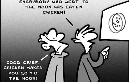
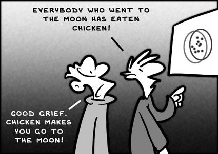
Correlation vs causation – don’t let them fool you
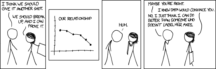
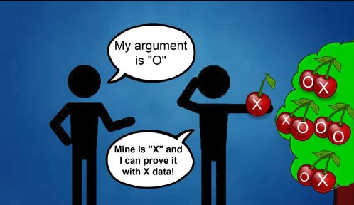
“Correlation does not imply causation”. If you have ever done data analysis yourself then this phrase must be engrained in your brain. As over-used as this phrase seems it is probably not said enough. There is a reason for the popularity of the content about correlation vs causation (isn't there?). Simply speaking, correlation means there is a mutual relationship or


