
This post is continuing the series on How not to get fooled by statistics. We talked earlier about the importance of checking the data sources and their relevance. Today’s topic is about cherry picking data to present only those that are favourable to the presenter while omitting the rest of the information. That may sound harmless at first but if you think about it the consequences can be very serious and damaging.
Sometimes it’s what you don’t see that matters. Presenting certain pieces of data and withholding other relevant information gathered from the study can be used to make the results look better than they are. With that said ‘cherry picking’ is not always done on purpose. Sometimes it’s just a lack of expertise. But quite often people do it deliberately.
Examples of cherry picking data
Let us have a look at the following chart (it’s a hypothetical example not based on any real results). Say you ran a customer satisfaction survey where respondents scored their satisfaction level with different aspects of the business. Then you present the results to the board and show them the following chart:
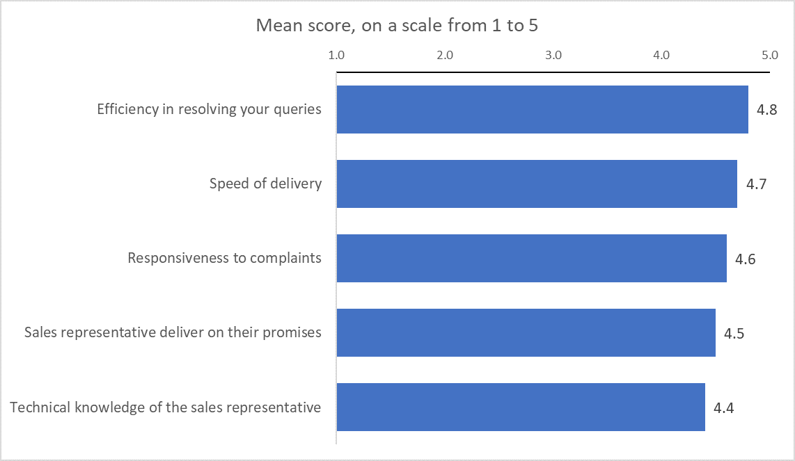
Looks quite good, doesn’t it? All scores are higher than 4 and the average score would be 4.6, so seems like your customers are pretty happy. Now let us look at a different chart:
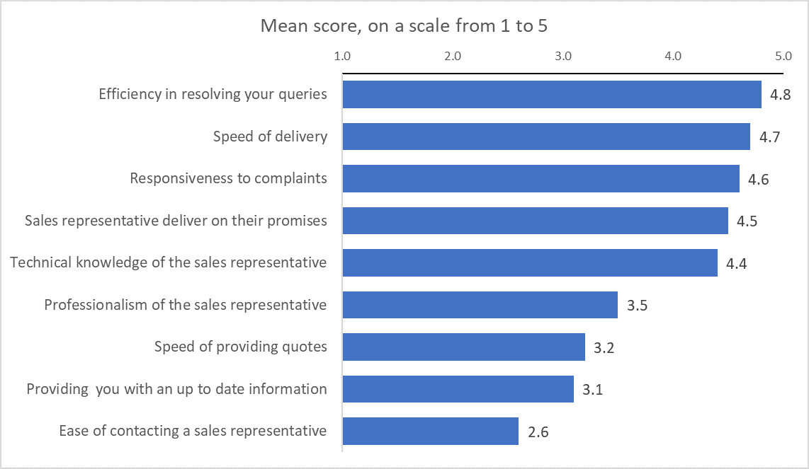
Well, apparently the survey had quite a few more measures that received much lower scores. Now your situation doesn’t look quite as good, and your average mean score is now 3.9. By cherry picking data and leaving out the lowest scored statements it’s easy to make results look much better than they are.
Another example, a while ago I used to work for a major electronics retail company, and they used to run a regular NPS measurement survey. After some time we discovered that phone survey results were much higher than responses collected online. So, hypothetically, if we wanted to report better results to the board we could have picked the results from the sample of people that responded over the phone (which we didn’t!) to get higher bonuses. Some companies publish NPS results in their annual reports for investors which then directly affects their share price, so meddling with those numbers can have very serious repercussions.
And one more example of cherry picking data, some of you probably remember the case with Colgate’s advertising. In 2007 they claimed in their ad that “more than 80% of dentists recommend Colgate”.
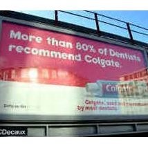
Image source: https://www.vrmb.com/statistics
What they conveniently forgot to mention was that during the survey dentists were able to name more than one brand they recommend. So, it is possible that more than 80% of dentists recommended some other brands as well. Some brand could have been recommended by 100% of dentists. We will never know. Were they lying though? Technically not, but one could say they lied by omission. The Advertising Standards Authority found the ad was in breach of advertising rules and banned it.
Generally, whenever you see just one or two big numbers, always question it. Ask yourself if there is anything else that would help you have a full picture, and then try to find any missing pieces of the puzzle.
If you want Aspect to help with your data or any research project, please CLICK HERE
Sources and further reading:
Featured image source: https://me.me
https://www.telegraph.co.uk/news/uknews/1539715/Colgate-gets-the-brush-off-for-misleading-ads.html


[…] examples (Colgate, Enron, tobacco): Aspect Market Research – Cherry picking data, McGill OSS – Cherry-Picking in the Era of […]
Awsome site! I am loving it!! Will come back again. I am bookmarking your feeds also